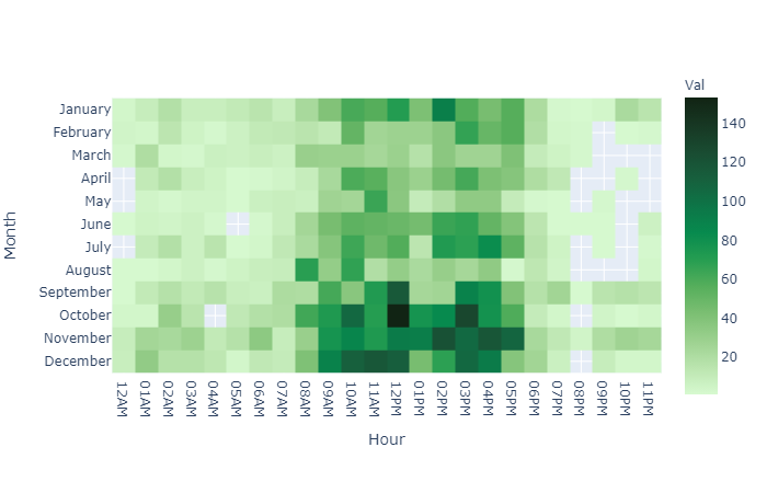
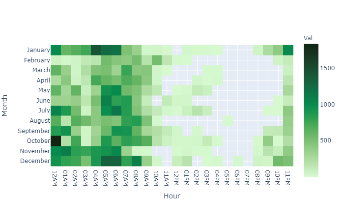
Data Entry Heatmaps
Grouping the data from the audit trail into Month and Hours makes it possible to accumulate data entry activities for smaller subsets(per Hour) Of course groups can be altered as per need for both the x- an y-axis.
- rectangular shapes -- darker green color represents more activity
- y-axis -- shows the amount of data entry activities per month
- x-axis -- shows the amount of data entry activity per hour
..::[How]::..
I will share the python code on my GitHub
- Python
- Pandas
- Numpy