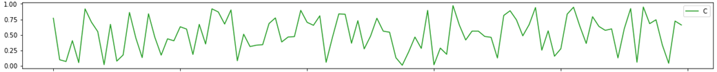
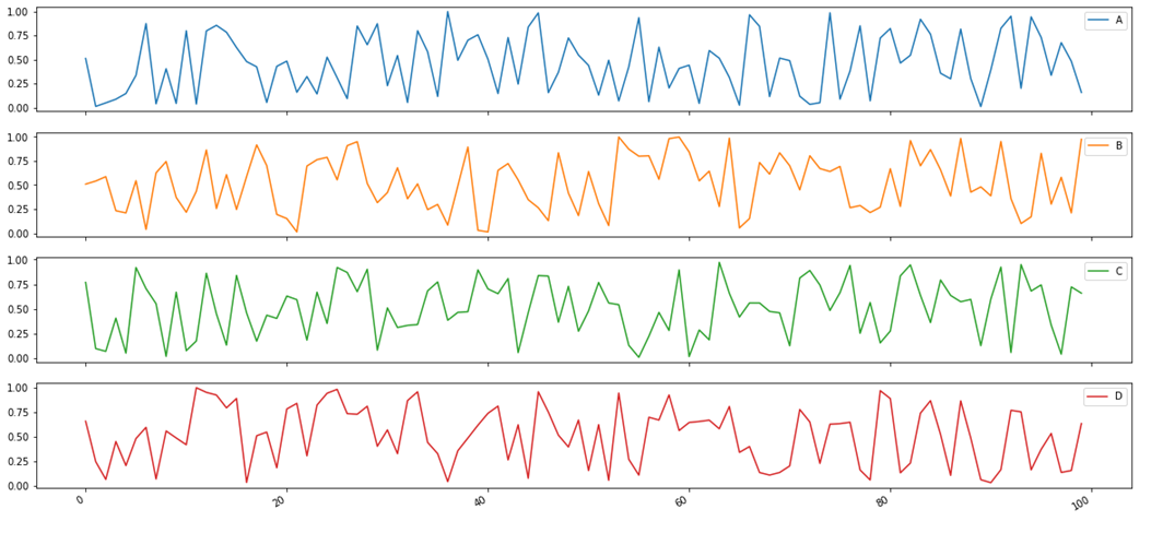
Trial Heart Rate
Have you ever been asked "How is the study going?". I've been asked that question and most of the time I did not have a clear answer. Well, I have to admit that for me the question was always part of the problem, because depending on who is raising the question possibly another answer would be needed. For me the trial is doing fine if the data entry activities do show this and this is why I tried to represent those activities here.
- A, B, C, D -- represent Site labels
- y-axis -- shows the percentage of max data entry activities
- x-axis -- shows the runtime of the trial
In this little exercise I tried to find an answer for that question by analyzing the data entry activities grouped by Sites. So the next time someone asks about the trial status I can answer "According to our 'Trial Heart Rate' everything seems to be alright.". Of course you can use the same approach to analyze and compare different trials.
..::[How]::..
I will share the python code on my GitHub
- Python
- Pandas
- Numpy